typograhy
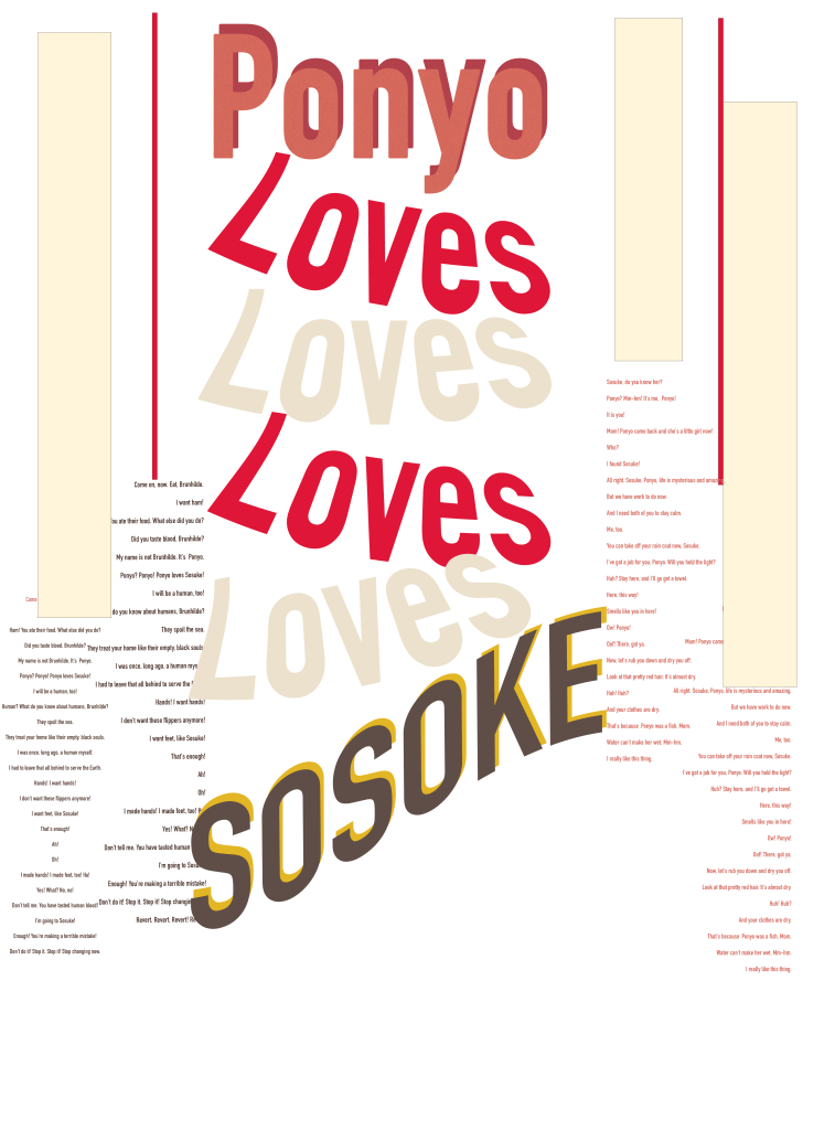
For this project, I created a typographic poster based on a line from the film Ponyo, “Ponyo loves Sosuke.” This simple statement carries the film’s heart: pure, childlike love that defies boundaries. My goal was to express that emotion through color, repetition, and layout, turning the words themselves into a visual rhythm that feels innocent and magical.
Designer choice
I used varying shades of red, pink, and cream to represent warmth, affection, and the connection between the two characters. The word “Loves” repeats and fades downward, echoing the movement of the ocean and Ponyo’s transformation from sea to land. The tilted text and layering give a sense of motion and playfulness, much like Ponyo’s energetic spirit. I kept the background minimal to let the typography and emotion stand out.
Refelction
I worked on this project using Adobe Illustrator for the second time, and I think I did pretty well overall. I experimented with layout and text effects to make the design stand out, but I struggled a bit with alignment and getting everything to line up the way I wanted. Even with those challenges, I learned a lot about spacing, balance, and how to use Illustrator’s tools more confidently.
Commnets
ciaracreates2025
