typograhy
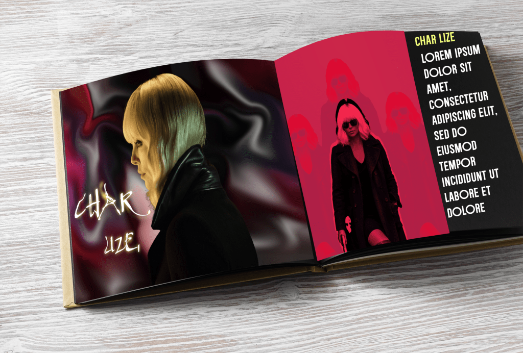
For this assignment, I was given two photos and asked to make the design my own using my creative skills. I decided to turn the images into a cinematic-style magazine spread inspired by the sleek and powerful tone of an action film. My goal was to highlight contrast and attitude while keeping a strong visual flow between both pages.
designer choice
On the left page, I used a soft glow and smooth gradient background to emphasize the subject’s profile and give a dramatic, high-end look. The handwritten-style title “Char lize” adds a personal touch that contrasts with the structured typography on the right. The right page uses bold red tones and sharp shapes to create energy and tension, with repeating silhouettes that suggest motion and power.
refelction
I actually really enjoyed making this project. I’m starting to get used to using Photoshop, especially the filters, textures, and liquify tools. It was my first time doing a mock-up, so there was a bit of a learning curve, but I had fun experimenting and seeing how different effects could change the overall mood of the design. This project helped me feel more confident using Photoshop and gave me a better sense of how to bring my own style into a layout.
comments
ciaracreates2025
